CSS Transforms, Transitions, and Animations
Transforms

The transform property applies a 2D or 3D transformation to an element.Each of these come with their own individual properties(rotate, scale, move, skew, etc.,) and values.

-
transform: rotate, scale, translate, skew,
- rotate( 20deg); // + or -
- scale(.75); // smaller
- scale(1.25); // biger
- scaleX(.5); // X or Y
- translateX(-10px); // X or Y
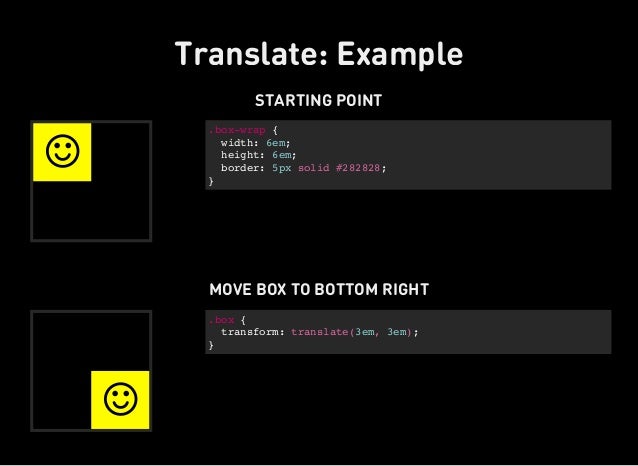
- translate(-10px, 25%);
- skewX(5deg); // X or Y
- skew(5deg, -20deg);
-
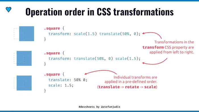
It is common for multiple transforms to be used at once, rotating and scaling the size of an element at the same time. To combine transforms, list the transform values within the transform property one after the other without the use of commas.

3D Transforms
Working with two-dimensional transforms we are able to alter elements on the horizontal and vertical axes, however there is another axis (is Z axes). giving us control of depth as well as length and width.
3D Rotate , 3D Scale , 3D Translate .(3D Skew is not suppurt 3d) as:: transform: perspective(200px) rotateZ(45deg);
- Backface Visibility When working with three-dimensional transforms, elements will occasionally be transformed in a way that causes them to face away from the screen. This may be caused by setting the rotateY(180deg) value for example. By default these elements are shown from the back. So if you prefer not to see these elements at all, set the backface-visibility property to hidden, and you will hide the element whenever it is facing away from the screen.
Transitions and Animations
- Front end developers have been asking for the ability to design these interactions within HTML and CSS, without the use of JavaScript or Flash, for years. Now with css3 its possible.
Transitions
- CSS transitions allows you to change property values smoothly, over a given duration.
- In this chapter you will learn about the following properties:
- transition
- transition-delay
- transition-duration
- transition-property
- transition-timing-function
Not all properties may be transitioned, only properties that have an identifiable halfway point. Colors, font sizes, and the alike may be transitioned from one value to another as they have recognizable values in-between one another. A handful of the more popular transitional properties include the following.
Transition Duration
- The duration in which a transition takes place is set using the transition-duration property.
-
Take value with seconds (s) and milliseconds (ms).
transition-duration: .2s, 1s; transition-timing-function: linear;
Transition Timing
- The transition-timing-function property is used to set the speed in which a transition will move.
- keyword values for the transition-timing-function property include linear, ease-in, ease-out, and ease-in-out.
ransition-duration: .2s, 1s; transition-timing-function: linear, ease-in;
Transition Delay
- On top of declaring the transition property, duration, and timing function, you can also set a delay with the transition-delay property. The delay sets a time value, seconds or milliseconds, that determines how long a transition should be stalled before executing.
transition-delay: 0s, 1s;
Animations
An animation lets an element gradually change from one style to another. You can change as many CSS properties you want, as many times as you want. To use CSS animation, you must first specify some keyframes for the animation.
-
In this chapter you will learn about the following properties:
- @keyframes
@keyframes slide {
}
- animation-name
animation-name: slide;
- animation-duration
animation-duration: 2s;
- animation-delay
animation-delay: .5s;
- animation-iteration-count
animation-iteration-count: infinite;
- animation-direction
animation-direction: alternate;
- animation-timing-function
animation-timing-function: ease-in-out;
- animation-fill-mode
animation-fill-mode: forwards;
- animation
- @keyframes
-
we can play with value as we want.
- Resources & Links
- http://www.alistapart.com/articles/understanding-css3-transitions/
- http://www.roblaplaca.com/examples/bezierBuilder/
- http://coding.smashingmagazine.com/2011/09/14/the-guide-to-css-animation-principles-and-examples/
- https://developer.mozilla.org/en-US/docs/Web/CSS/CSS_Animations/Using_CSS_animations

